
|
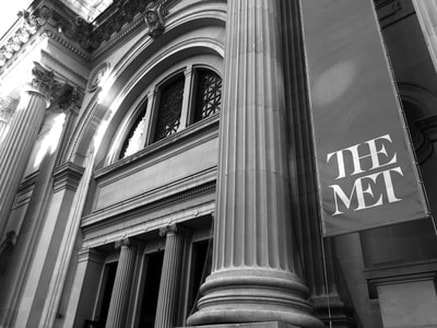
I selected this photo because I thought it was . Compositionally, there is an interesting point of view because it was taken from a different angle, from the side. The leading lines also make the picture engaging, by drawing the viewer's eyes across the photo as a whole. To take this photo I had the camera set on 1/125 for shutter speed and it had a large depth of field. The mood is almost mysterious, since the museum is in black and white, making it seem gloomy.
|
|
This photo was taken for the pattern and texture assignment.
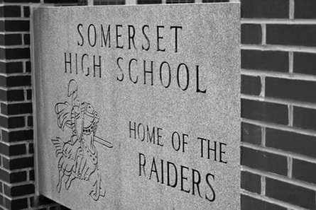
What I like about this photo is the pattern and repetition of the bricks. I also like the framing of the sign by the bricks, since the columns on the sides frame the sign and allow it to be the focal point. My point of view was the side. The photo follows the rule of thirds because the sign is in the center, while the brick columns take up the two sides of the photograph. The depth of field is shallow, since the sign is in focus and the bricks are blurry. The ISO was set to 200 and the White Balance was daylight. I chose this picture for my portfolio because I really like this sign, how it's the focal point, and how the bricks are blurred, drawing the viewer's eyes to the center. |
|
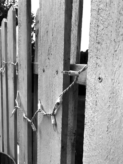
Looking at this photo, the compositional element that is most apparent is leading lines, in both the wood panels, and in the string lights. There is also texture seen in the wood paneling. When I edited this photo, I adjusted the exposure and the contrast, to make the wood panels darker than the sky in the back. The camera was set to daylight for white balance, and 1/125 for shutter speed. This photo has an interesting point of view, since it's taken from the side, where the sky and trees can be seen through the openings of the wood.
|
|
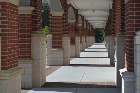
I selected this photo because all of the different lines, leading your eyes across the picture, really brought the picture together, and it was really interesting how they all worked together. Compositionally, there is also repetition in the brick columns, the shadows casted, and the ceiling sections. Also, the rule of thirds is followed. To take this photo I had the camera set on 1/125 for shutter speed and f/22 for aperture/depth of field, since it's all in focus. I chose this picture because I really like how the lines drag the viewers' eyes across the picture, down the continuing columns.
|

|
Looking at this photo, the compositional elements most apparent are the negative space and the background of the bright sky. I didn't edit this photo, because I didn't need to, the sky was already very blue on it's own so I didn't need to enhance the exposure or contrast. The camera was set to daylight for the white balance, and had an aperture of f/22. I selected this photo because it was really appealing with the really bright blue sky. Also, this photo was taken on a warm day, and the blue sky reminded me of summer.
|
|
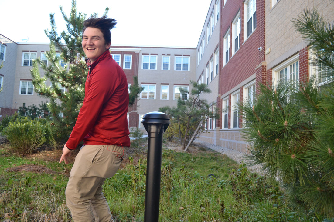
This photo was taken for the motion assignment. What I like about this photo is how happy Henry looks. My point of view was taken from the side. The photo follows the rule of thirds because Henry's on the left of the photo, with the side of the school directly behind him in the center, and the the other side of the school on the right of the picture. The depth of field is shallow, because Henry is in focus and the background of the trees and the school is blurry. The ISO was set to 200 and the White Balance was daylight. I chose this picture because it's amusing and because of how happy Henry looks jumping over the pole.
|
